TL;DR: I’m enjoying Alberto’s DataViz MOOC, and all things that are pretty aren’t always awesome. :D
So after missing out on the first edition of Alberto Cairo’s online course on Introduction to Infographics & Data Visualization, I was really looking forward to actively take part in the second edition. Sadly, I got super late (long story!). Still, better late than never, right?
The course began with Alberto’s introductory video, and a series of short videos to get us excited about the nuances of the new rage in town: Infographics. He raised some interesting points (mostly questioning WHY something is used in the graphic). So in a very functional way, every element should help improve the communication of the graphic (otherwise it’s junk!)
As an assignment, we had to pick one of the many infographics. I found one on Social Media, and being slightly active on Twitter (and a bit on Facebook), this caught my eye. Our task: Critique (& suggest alternatives to) the infographic.
First, here’s the infographic: Best time to tweet or post on Facebook by Cool Infographics.
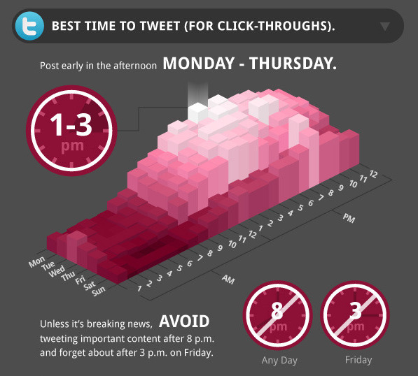
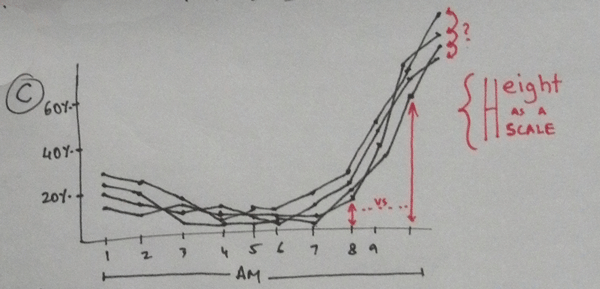
My first thought when I saw the infographic: “3D Visualization! Cool!” But beyond the pretty looks, it’s all ambiguous. While it says that it’s about finding the best time to get highest click-throughs, the 3D chart makes it impossible to read half the data. The summary of the chart is shown on top (Post early … Mon-Thurs), and doesn’t match with the glowy block (which only highlights Monday). And the height of those blocks & the color (Tint) both represent the same variable – Click throughs – but don’t explain what the scale/unit is (% of followers who clicked? Total number of clicks?). Ouch.
The clocks shown below seem like they’re about some other aspect, but instead summarize the fancy 3D chart (again!). The mix of range as pie-chart-like-division and canceled clocks (Not 8 PM, or not after 8 PM?) just feel out of place. The description confuses even more with words like traffic (on twitter or on the page linked?), important content (huh?), competition etc.
I noticed similar thoughts all over the discussion forums, and wondered if I could quickly think of some variations/alternatives. Here’s my process:
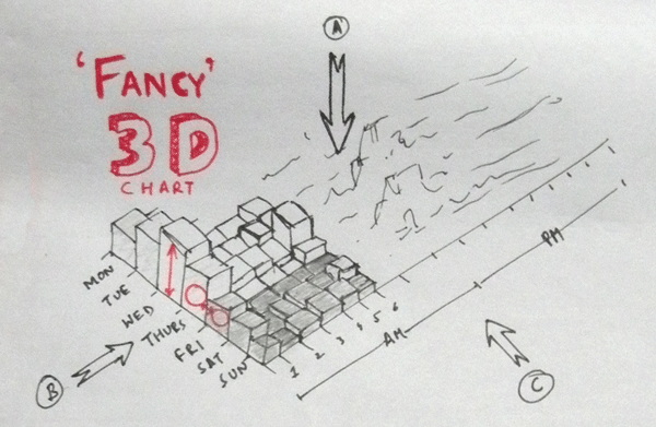
I first looked at the original infographic, and since both height & color (tint) are depicting the same variable, I decided to remove one dimension and make it a simpler, 2D graphic. So looking at it from different sides, I could see 3 variations:
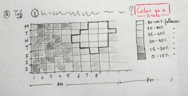
A (From top): Days vs Time, color (tint) represents click-throughs. This seemed the first thought, and could be quite similar to the original (except the 3D effect). I also thought that if there was a clear pattern (like afternoon being best time), it could be highlighted directly by grouping adjacent cells (and a thick/darker border). Seemed like a good option for a quick glance and hiding extra details.
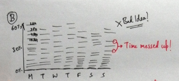
B (From left): Click through vs Days. This one was really weird: it looked like lines stacked on each other (and made some sense in my head), but on paper it looked worse than the original! Breaking time into disconnected bars does not work. At all.
C (From Front/Right): Click through vs Time, individual lines for each day. While this became slightly messy (imagine sketching 7 lines!) it worked nicely: Gave an overview (higher for all lines = better time), as well as more details (is 7AM Monday is better or 7AM Wednesday?). Since black lines were confusing, I redid this in color:
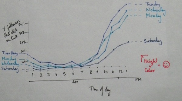
I think this looked okay. It still lacks a summary part. Maybe a slight gradation in the background would help show the best/worst time(s) better.
I kept wondering about what can be done with the clocks. The single pie-like clock (for AM or PM) and double (wiith a dash that joins AM and PM) were confusing.
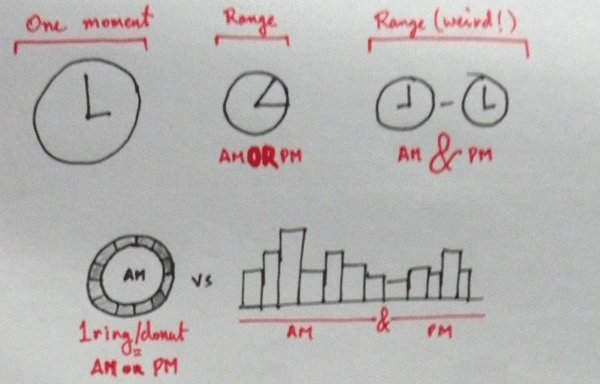
An obvious way would be to use a bar chart, but I felt the clock metaphor works quite well in the circular form, and a donut-like ring could be interesting to play with. So here’re my “Connected donuts chart!”
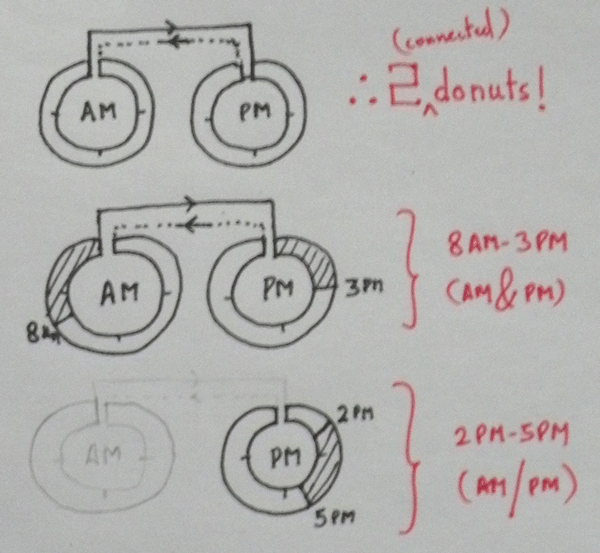
The idea: connect two donut charts (AM and PM), in the way time flows (12AM-6AM-12PM, 12PM-6PM-12AM). Show range with AM and PM, or just highlight the particular donut (for AM or PM). Might be fun to explore later (the connections are so not obvious!)
So those were some of the thoughts while doing the first week assignments. I sure had fun sketching these out. Would love to hear your feedback: Do you think the suggestions work better, or original was better? Any further details you would tweak?
Update: Oscar Huerta mentioned that the original source has a better visualization. And it happens to look just like Sketch A (though you need to come up with your own axis labels!)
PS: I’m also enjoying my stay at the NID, Ahmedabad campus, where I’ll be for two weeks doing shadow theatre. That’s what kept me busy all this while! :D