Project Brief
What would a map of wisdom from all around the world look like?
Project Context
- Type: Collaboration with Project Fuel, funded by Art grant from SIF
- Duration: 4 months
- My role: Map design & data visualization
About the project
I collaborated with Project Fuel on designing World Wisdom Map — an inspiring collection of life lessons from people around the world. We built an interactive, map-driven repository of stories that we collected from every country, and then summarized it as a data-art-driven long narrative.
This project was funded as part of Singapore International Foundation (SIF)’s Arts for Good (A4G) grant.
My role
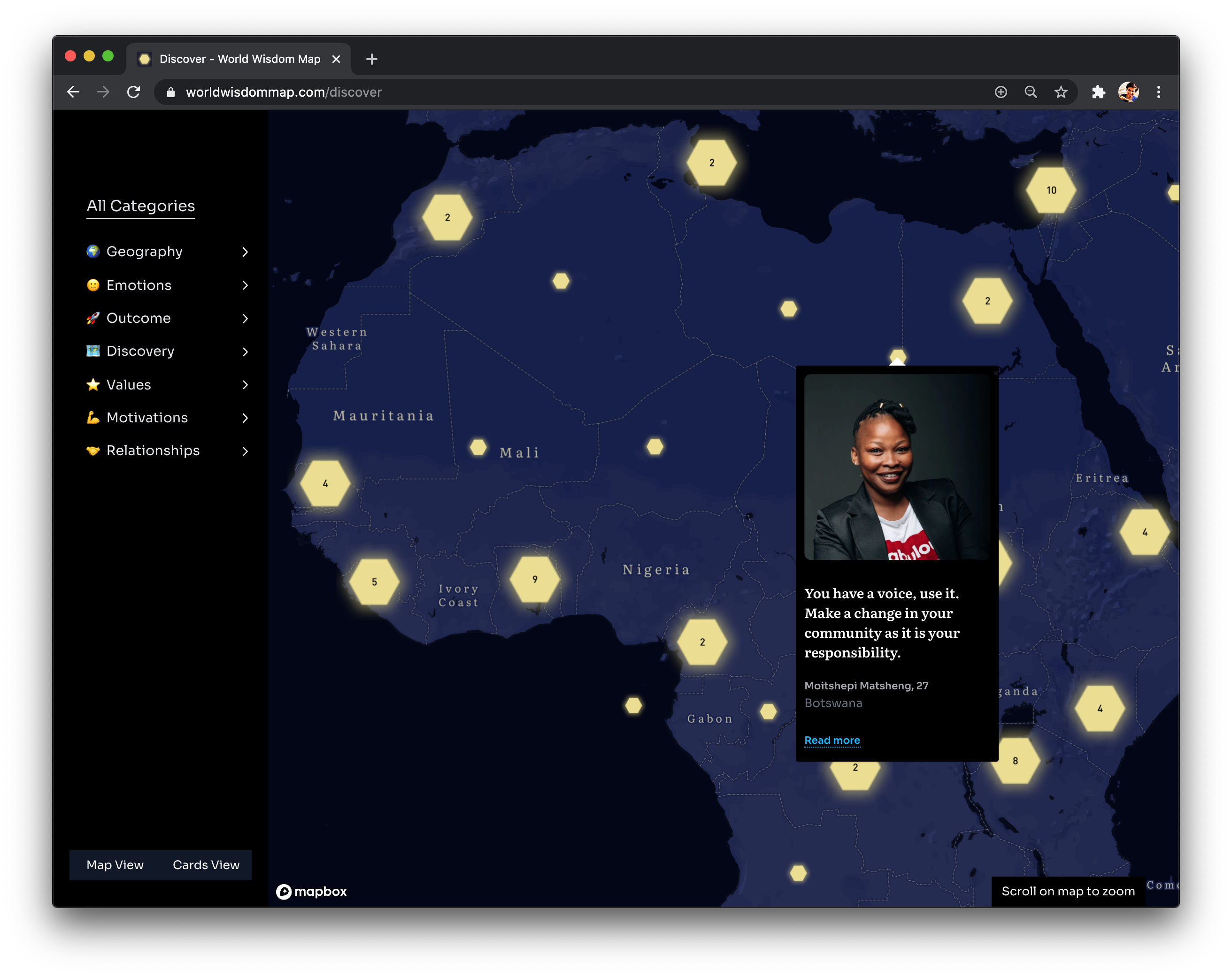
I designed a custom map in Mapbox to highlight each wisdom glowing like fireflies on a dark night. We used this map for the discover page with life lessons as clusters.
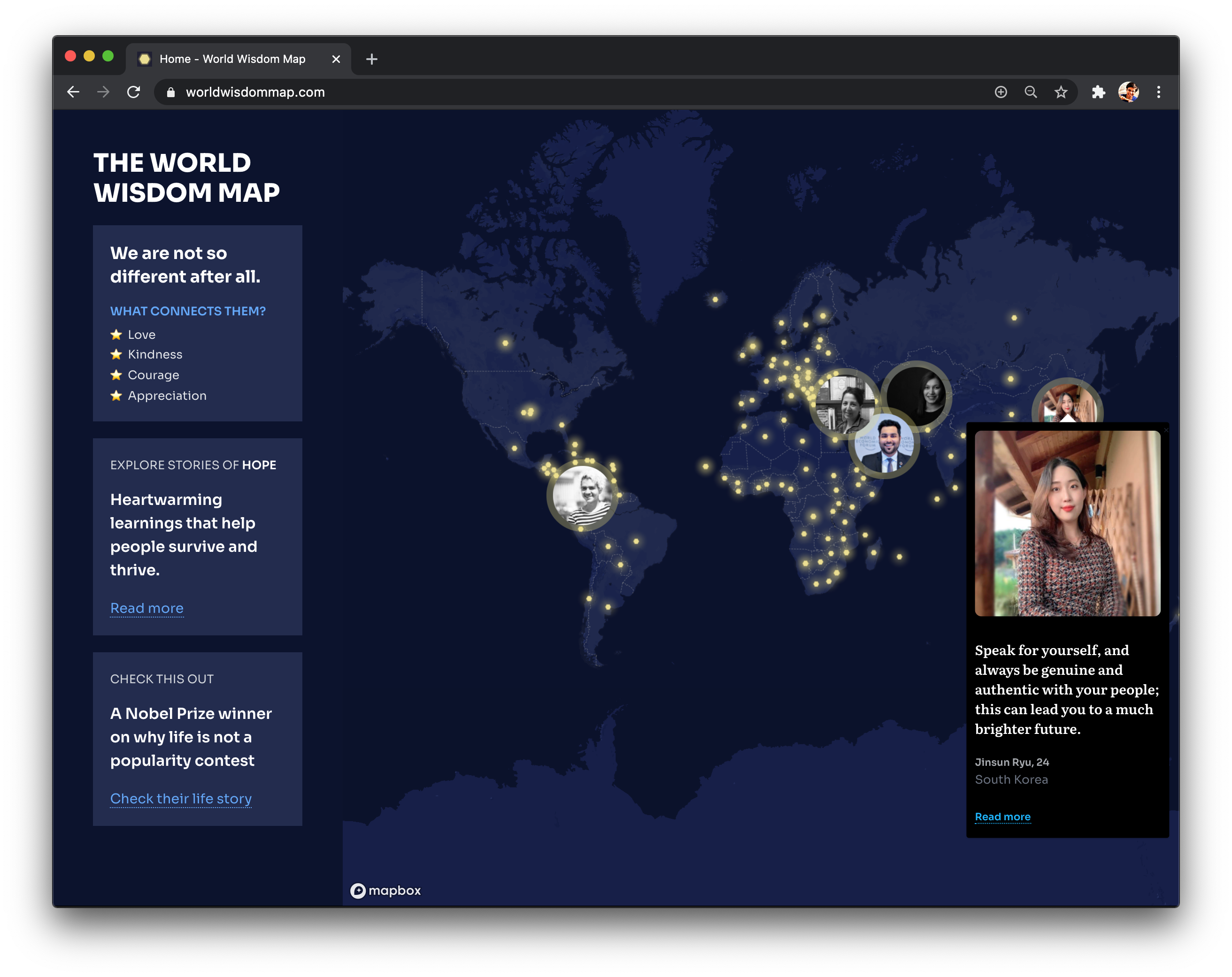
For the homepage, I removed the clustering so that the firefly effect really shines. We also added photos of a few randomly selected participants to tease into interacting with the map.
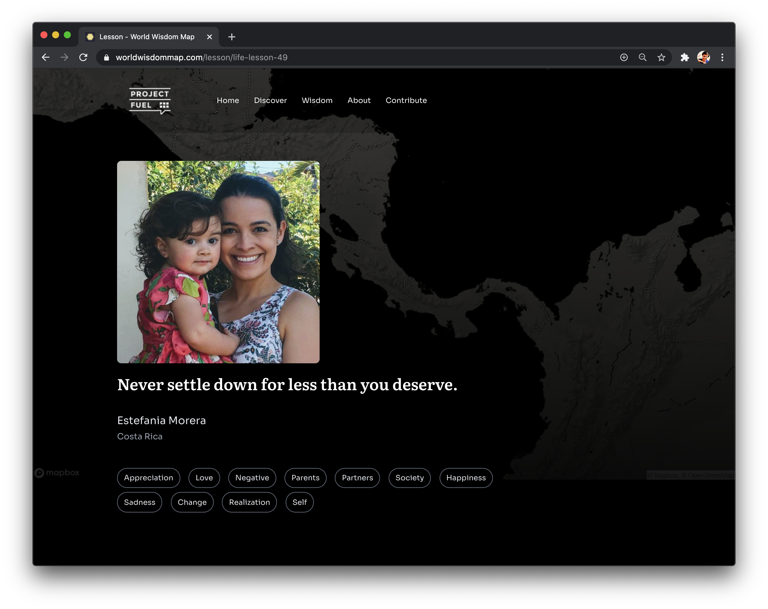
I designed a customized grayscale map to add some context to each life lesson’s page.
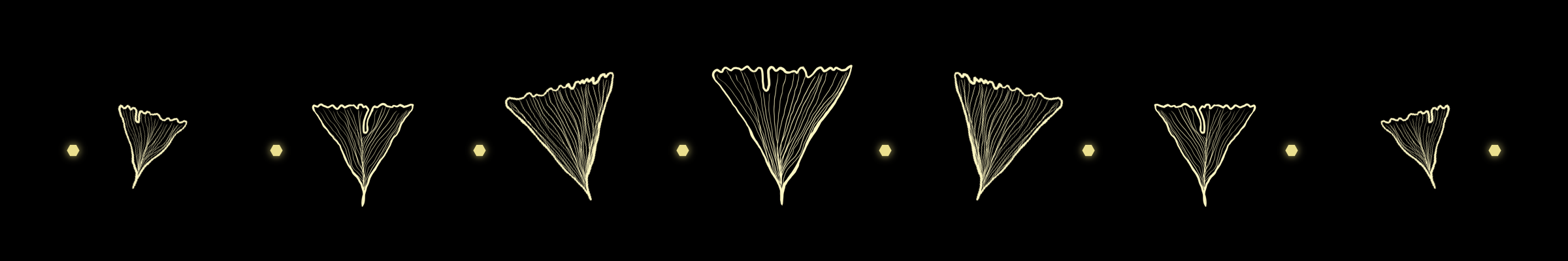
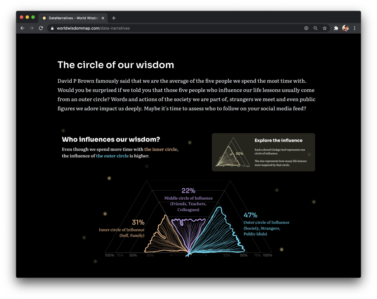
Once we had all the life lessons, I worked with Ruchika — NY-based Data Scientist — to turn the key insights into a data narrative. I used a metaphor of Ginkgo leaves — known for their resilience & longevity — to represent these insights that will stand the test of time.
Explore the project
Explore these life lessons on the website — preferably on your desktop, so you can soak it all in!
Response to the project
The project was featured on MentalFloss, LBB, FirstPost, Hindu & other publications.
Reflections
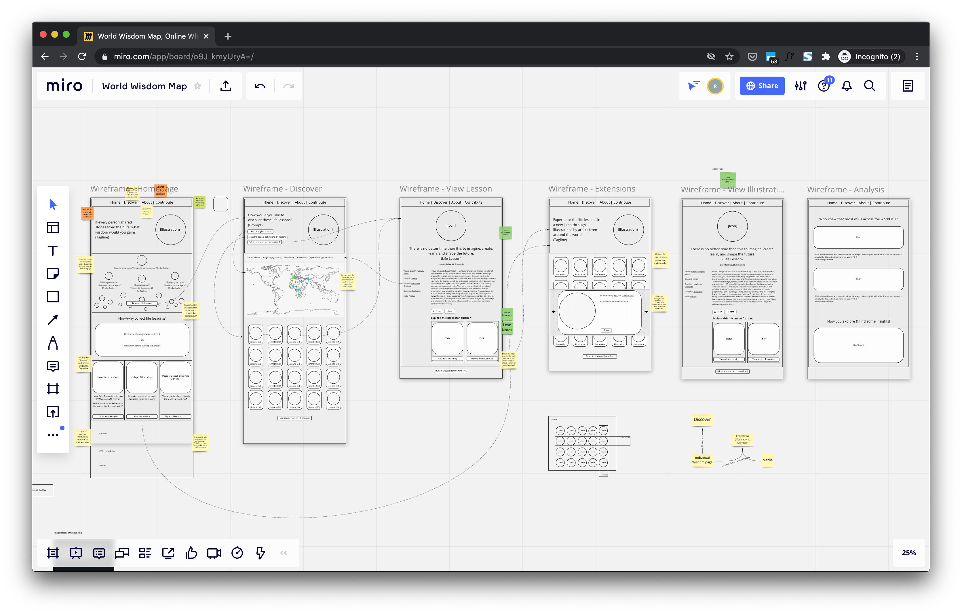
I loved collaborating virtually with an inspiring team. I used Miro to discuss information architecture, map concepts & wireframes, and I doodled on Procreate for sketching the narratives & illustrations. We also used Figma for collaborating on the website design with Mayank. All these tools really enabled us to collaborate seamlessly across timezones.
My favorite part was getting a chance to use metaphors in my work. After listening to a wonderful lecture by Nithya for our NID Haryana course, I became more conscious of semiotics in visualization. Making the firefly & ginkgo leaves metaphor work well in this project was a delight!
This pandemic year has been filled with anxiety, and this project gave me a reason to smile. Thanks to this project, I collaborated with a wonderful group of people — developers, UI designers, data scientists — who made this project come alive. This was my first such collaborative side-project, and I hope to do more of these in the future.