This semester began with a module on Narratives, and when I got a chance to pick a topic for my Information Visualization module, I just had to visualize this movie’s non-linear narrative!
Spoiler Alert: In case you haven’t seen the movie, I suggest you see it before seeing the final visualization (which contains plot & quotes).
Ready? Click and view the visualization!
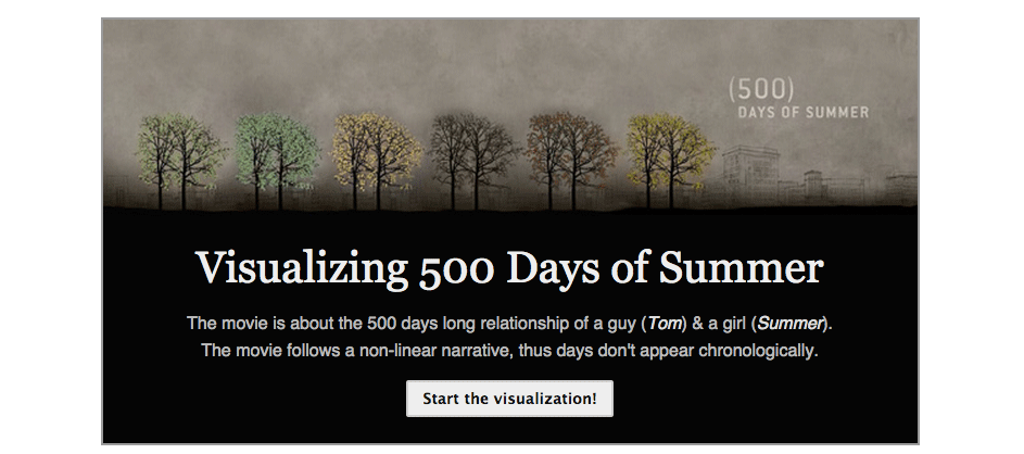
Read on further to know how the visualization was made.
Step 1: Pick a topic
In the narratives module, we watched and discussed different styles of narrative. When it came to non-linear narratives, we watched Pulp Fiction (in class!), and I really wanted to sketch out the whole narrative. Since Pulp Fiction is too mainstream, I thought why not visualize 500 days of summer? What was great about this movie is that the story is quite ordinary (boy meets girl, they fall in love, break up and the boy finds another girl), yet it was quite popular. I decided to find out why!
Step 2: Collect the data
Like any other visualization project, the next step was to collect data. After going through the movie script, wikipedia, and tons of reviews, I decided to just watch the movie instead and record what I want myself.
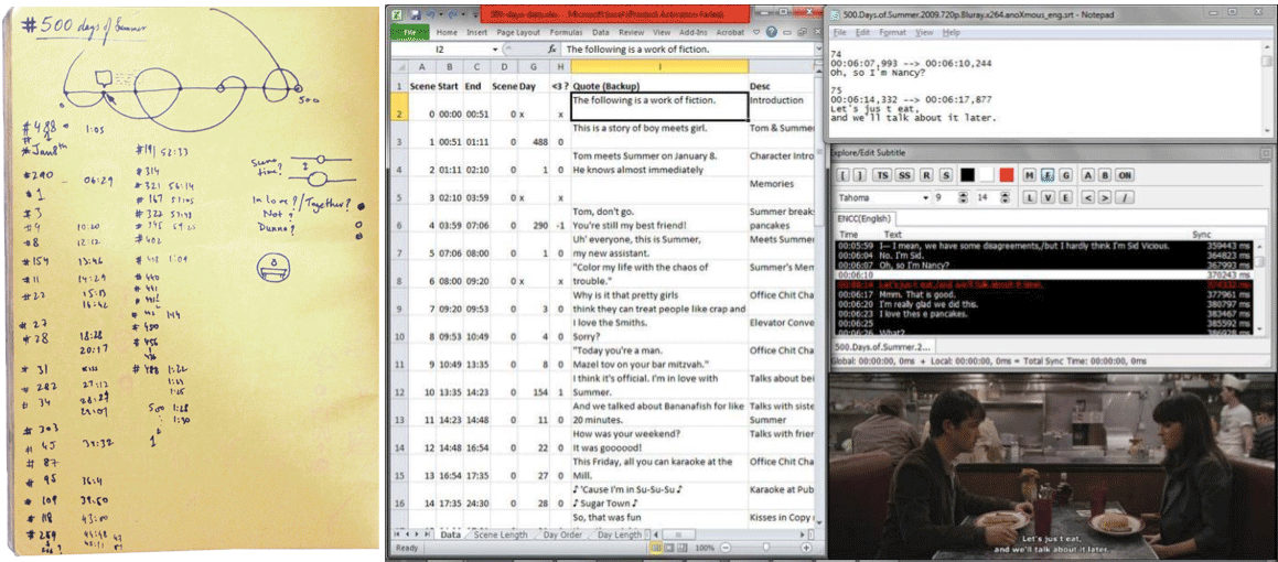
First, I roughly jotted down the order of days, and a time stamp of any interesting incident/quote. This gave me some basic idea about the timeline, and I transferred this on an Excel file. I watched the movie again to pick one good quote for every scene/day. I also recorded a few other details that I thought might be interesting (lots of back & forth!).
Step 3: Clean the data
After watching the whole movie a couple of times, I had the following: Scene Number, Start time & End time, Scene length, Day Number, Interesting quotes, Scene Description, Scene Location. I took a call on some special cases: scenes not about a particular day (Flashbacks, Interviews etc.), or scenes that had multiple days (456-476) etc.
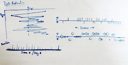
Step 4: Play!
Now that I had the data, I decided to ask a few simple questions: Which day is shown the longest? Which days are they together? How were the scenes distributed?
So I switched to my favorite tool: Excel!
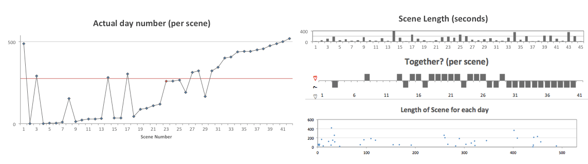
Excel popped some interesting charts: you could make out a few clusters in the days that were shown, the choice of days just after the breakup to show contrast, and how the last third of the movie is quite linear.
Step 5: Sketch!
I explored a few alternatives, but found thread arcs the best way to show such a narrative.
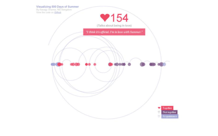
One issue with arcs, when used like above, is that you find it harder to trace the path (do you move right, or left?). To correct that, I decided to use them like a continuous spiral: top half is when days go ahead, bottom half is when days go backward. Here’s a quick sketch:
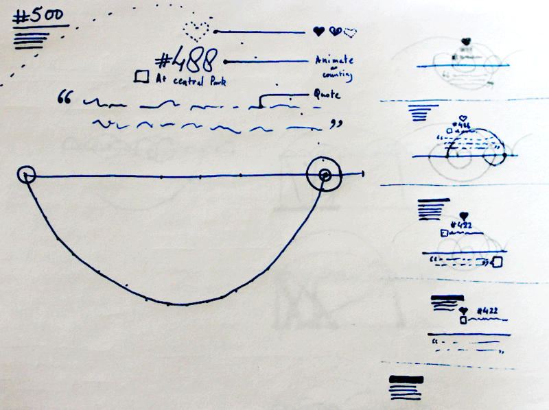
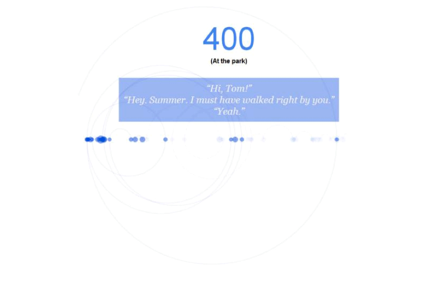
I also wanted to show the day number, the scene location, and one quote from each day, and felt that this layout worked quite well.
Step 6: Prototype!
Now comes the hard part. I’ve played with Processing before, but I wanted some interactivity and after a bit of hit & trial in Processing, it made more sense to use a SVG based interactivity (instead of mapping cursor position and then adding effects). This was a good excuse to learn Javascript and play with D3!
Overwhelmed by the resources & tutorials available, I started reading Scott Murray’s Interactive Data Visualization for the Web. This turned out to be a great choice: the book is available online (for free!), and has a very steady pace with minimal code. Best part of the book:
Halfway through @alignedleft’s Interactive Data Visualization for Web, & loving all the jokes & puns! Learning d3 couldn’t be more fun! :D
Since what I wanted was fairly customized, I decided to code it myself instead of using one of the charts in the D3 wiki. Getting the bubbles for each day (size based on the scene length) was fairly simple:
Making the arcs took some time, since I wasn’t used to SVG’s Arcs (paths!), and couldn’t figure out how to use the .attr() to define the coordinates. Instead, I referred to MDN & ended up writing it as:
return "M "+prevX+" "+(h/2)+" A "+r+" "+(r)+" 0 0 1 "+nextX+" "+(h/2);
This was quite close to what I wanted, and I decided to stop wasting more time on arcs.
Step 7: Color ‘em up!
Colors are always the hard part for me, since I’m still not so confident about picking palettes. I wanted 3 colors to show different stages in their relationship, and played with a few color schemes from Kuler on the theme “love”.
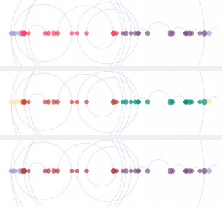
The lighter tint of red (pinkish) felt nice. Shades of blue & purple seemed to fit the acquaintance & separated feeling, and contrasted well with the red.
Step 8: Y U NOO MOVE?
Making static visualizations is quite easy, but we were expected to make this Interactive. This meant that I could progressively show the arcs (instead of all at once), and keep some details on demand. Using a tip from Parag, I changed the stroke-dasharray to get the arcs to animate, and the bubbles on hover showed quotes & info.
Step 9: Feedback
I presented this during our module-break (July-end). Some of the suggestions were to add help text while the animation plays, speed up the animation, and add an axis. Those who had seen the movie loved the quotes and tried to guess which day each bubble represented.
Step 10: Wrapping it up
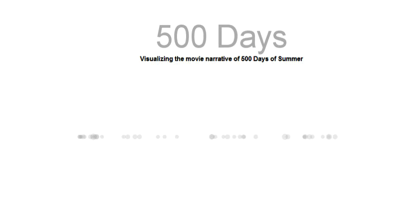
Like a typical lazy student, I let this rest for two months, and decided to finish it yesterday. I added some intro text (and used Annlaurence’s lovely wallpaper), axis, scale and voila!
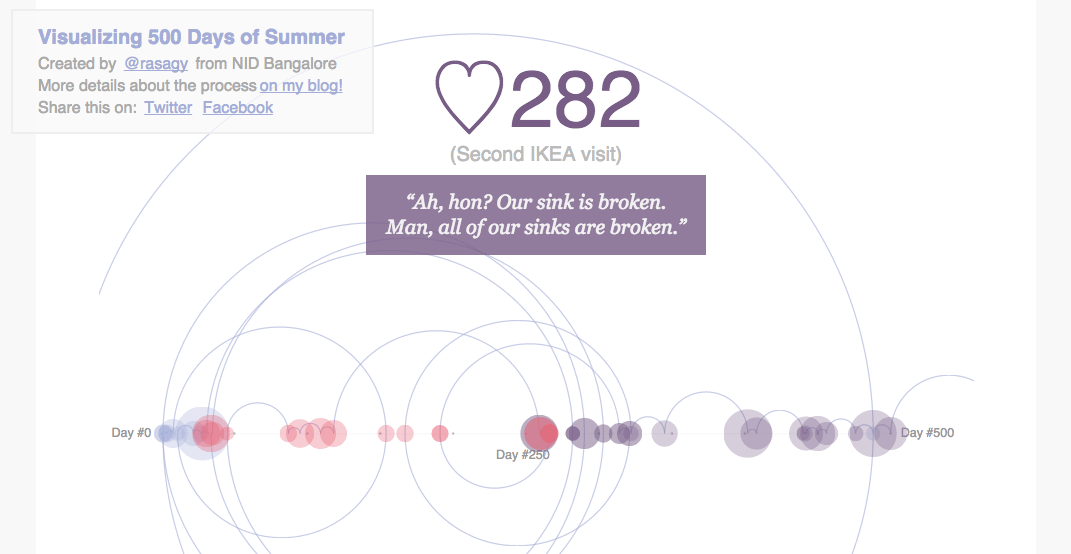
Looking back, I think the spirals came out okay (I initially expected them to be more separate). The varied difference in the scene lengths meant I couldn’t use a correct scale for the bubbles (I hope Tufte doesn’t haunt me in my dreams!), and a few of them get overlapped by the larger bubbles around them. I guess these are the limits of my design, and I should keep this in mind the next time I make something similar!
Two interesting links that I found during the past few months:
- A little after my first draft, Jake posted a great tutorial on animating svg paths. I should probably use this instead of my hack.
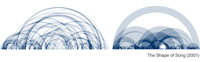
- A couple of weeks later, Manuel Lima posted an excellent set of chart metaphors (with some lovely vintage arc charts!)
Super thanks to Venkatesh (my discipline coordinator) for his critique (and making sure I finish this), and my friends Kenneth, Noopur, Akash, Shweta & Anushka for their help!
As always, I’ll love to hear any feedback/suggestions in the comments below. And if you liked seeing it as much as I enjoyed making it, do share it! :)